Wednesday, April 15, 2009

Final Project Final Post


Now that my project is solidfied, I just wanted to make a really clear post with a really clear link.

The EAS299 Final Project, including a downloadable .pdf version is available right here.

By popular demand, I present the image that inspired a generation.

Word Count for the downloadable version at that link is 4132 without the final line. Word Count for the online version should be more or less similar.

Thursday, April 9, 2009

EAS299 Final Project

This is more for me so I don't lose the link, since it's so unwieldly.


I'm going to build my final project as a website (and word document given the new outlines we were provided). It's a work-in-progress, but I plan to continue building it up over the next month as I flesh out my ideas. A lot of stuff right now is cliffnotes or temp stuff, so I wouldn't even bother commenting on it. I'm trying to hammer down exactly what I want to focus on, but I know I want to do "8-bit Sprite Art", "Superflat", "Superflat + Depth (Postmodernity as seen in the one page on the Blog", Using the Superflat Manifesto, and then branch off into something else (probably take some scenes of 8-16 bit Japanese art and analyze them and of course create the bridge that took us from 8-bit to 16-bit since it's just an extension of the technology). This is just so I have a conhesive place to begin building it. I suppose this also qualifies as my final post on my blog, I'll update it with a firmer outline when I fully flesh everything out this weekend.

Horrah for talking to myself.

(This was just an excuse to use iWeb on my Mac)

Edit: Oh I know one thing I need to accomplish with this project. Work in technical information and bore people to tears with it. How many pixels in a sprite? Oh it's relevant. How many colors per sprite? OH IT'S RELEVANT. The clockspeed of the CPU on the NES? Better believe it's relevant. There is a fantastic technical document here: http://nesdev.parodius.com/NESDoc.pdf. We will be seeing much of it in the future.

(8x8 Matrix of Pixels per Sprite)
(3 colors per sprite + "transparency")
(8-bit 6502 processor)

Oh also, if anyone is interested. I just began buildng out my EAS Capstone project's internetness. It's still a major W-I-P but it's beginning to soldify. It's going to be an exciting website experience and a boring paper version that can be .pdf'ed offa it. That is located at this link right here. I am aware there is quite a bit missing from there as well.

Monday, March 30, 2009

Cuteness


Elephants are cute. As are kittens. Both have some grounding in Japan (one for the artist, the other because Neko's are everywhere).

So our elephant friend here is cute because of multiple things. The first being the direct size contrasting between the two sculptures. The one of the left is admirably cute given his oversized physique, but he is simply a tool used to then draw us to the smaller version, which when compared to the big guy is EVEN cuter. Its like a mother/son elephant thing where size is directly porportional the amount of cuteness. The color pallete chosen as well heightens this because they are such friendly, pastely (easter eggish) colors that can do no wrong. The size of the smaller elephant is also supposed to give a sense that it is probably a baby or small child. Even though the sculpture is probably pretty big compared to a human, I feel like it is screaming to be picked up or embraced. That is why I think there is such a direct, parallel porportional comparison going on between the two statues. Oh boy do I love elephants.

But, I love cats even more. Check this guy out. This photograph was designed (and probably photoshopped heavily) to instill all the virtues of cute within this kitten. It has been personified to such a degree that it looks like it wants you to give it a human hug (or at least pick it up like a baby). In fact, the cat looks very much like a baby that is simply grappling for your attention. The cat is also very clean and fuzzy, instilling many pleasurable aesthetics to force us to love it. In addition, we really cannot see claws or anything else threatening about the image (teeth, hair standing on end, etc..) so it portrays itself as a fuzzy stuffed-animalish creature. This is the cuteness from the images above being displayed as an actual living thing, rather than a lifeless sculpture that only looks inviting.

Have I said the word cuteness enough? No? CUTENESS. (It's almost sickening)


Wednesday, February 25, 2009

Lantern


My goal with the selection of images here was to pick shots from where I actually visited while in Japan. That of course didn't work out too well. I've seen the Imperial Palace in Tokyo, as well as Ueno Park. But the other two were just picked because I liked them.


Good golly this software doesn't want to play nice. Ok, so starting at the top I have one of my more least signifigant images
(My LSI if you will). I just picked this one because it looked pretty neat to me. The gate has a great mixture of colors and it just
reminds me so much of what I saw while in Tokyo (although this gate is not specifically from Tokyo from what I've gathered).

The second and (well, the fourth may or may not be) were supposed to remind me of Ueno Park, mostly because the second
image definitely IS Ueno Park. There is a bit of a confusion there with that fourth one as it may or may not
be Ueno Park. Anyway, I visited there while I was staying in Japan and that place was just fabulous. Really peaceful,
with a great temple right in the middle of the park. A temple where you aren't supposed to enter/take photography,
a temple where I DID enter and take photography, and a park where I am hereby banned from re-entering. (I kid, they never caught me).
But it sure brings back a lot of memories. When we were there the cherry blossoms were out
and it was just a gorgeous place. But the only issue was right outside of the park was the huge cityscape, which
kinda ruined it a bit if you looked too far off.

Image 3 is a temple at Nara. I picked this one because Julia was attacked by a rogue deer there. She also
had many other shenanigans. No other reason for choosing this one.

Number 5 is one of the more memorable things I've seen. The Imperial Palace was just freaking awesome.
We went on a day where the weather was perfect, and the light was shining through the trees onto the palace
giving it a Studio Ghibli effect. Really awesome. This of course wasn't the angle we were seeing it at
(we were much further back, you had to look at it from the main bridge) but it was still breathtaking.

Visual Studies Version

Mizenko-sensei had a good point. Many of these slides do show extremely long lines of identical or near-identical objects.
I don't know the actual reason for this, but I do agree with Mizenko-sensei on the point that it
creates a feeling of endlessness. I suppose since the middle three prints are supposed to be representing a time
long since past, it would be possible that this is a religious reference supposed to indicate the endlessness of time
itself. I honestly don't know what to say about it though, as I feel like I'm poking in the dark here.
But it certainly does give a feeling of vastness, which is something I noticed while I was in these
types of Parks. They always seems to have long, somewhat straight roads and the entire area
is deceptively longer than it seems. When I was in Ueno though, I saw many other "one-off" statues
as well, so I don't want to imply that this is the only type of format for displaying statues. (Then again,
I saw Ueno in THE FUTURE, whereas we're clearly referencing the past here).

In regards to Mizenko-sensei's second point, I regard the middle three images with an association to the Tokugawa Shogunate
simply because (from my very limited Japanese history courses) this just screams pre-modern Japan (well the dreamy version of it anyway).
All of the images are heavily imbued with nature, but at the same time they are completely spotless.
The world just seems to clean and pure in all of these. We see the traditional clothing in a few of the shots,
as well as many of the objects I just associate Japan with. Cherry Blossoms, clothing decor, the types of statues,
the lamps and the temple. This is what I associate with Japan from before 1930, and is always what
I was looking for while I was in our crazy futuristic Japan. (Found quite a bit too, Beppu is a great city
for this kind of thing because they try to keep many of the older shrines restored. So you would see
all these tiny shrines on the side of the road, even though they all seemed deserted.)

A quick note about the colors. They are all just so dreamy. The sky is a friendly blue, the cherry blossoms
basically pop out of the slide with a vibrant purple. The water also (on 5) looks mostly unpolluted, and
all of the walkways are (more or less) represented in a familiar tan/brown and are in extremely
good condition. It feels as though all of the colors are slightly more dreamy versions of their original shades,
which helps gives each print that "mental nostalgia value" of how life should/would/could have/was been. (Wow)
All of the slides give off a friendly vibe due to the color choices, and print a passive pacifist version of
these landscapes.

Sunday, February 8, 2009

Ukiyo-e First Draft


Evan Wolbach

January 30, 2009

Mizenko-sensei

Legendary Chinese Figures (BAM2006.065)

The woodblock print of these “Legendary Chinese Figures” was composed by Utagawa Kuniyoshi on June 5th, 1853, eight years before his death. These prints are marked as some of the later in the series of Ukiyo-e, as is evident by the bright and vibrant colors, as well as the attention to specific details within the print. The prints actual title is “Tsûzoku Sangokushi: Kwanu go-kwan woyaburu no zu”. The entire print is actually made up of three woodblocks, which stretch to show the surrender of Sôsô and his men on a bridge to Kwanu and his forces.

The setting for these prints is on a bridge overlooking a river and a background forest. Humans are located throughout all three parts of the print and act as the focus to the piece, as it is depicting a surrender of forces. The background represents the majority of the nature present, as it is not the focus of this piece; instead it has such a small role that it is immediately blended in with the men in the background. The entire foreground represents humanity in such a way that nature is phased out, and manmade structures, and men themselves make up the entire front. The leftmost print features Kwanu who is riding majestically on a warhorse. He is wielding a monstrous halberd. In terms of the other people represented in the painting, he is larger than life, perhaps referencing his power in the situation. He also takes up the most space in any of the three sections versus any other men present. His horse also shares this trait, by being an extension of his “power” and overshadowing both his follows (in the background) and the men who are surrendering to him (the powerless). His weapon is so large, that is stretches from the leftmost print to the center, where the focus of the surrender is taking place. We see the soldiers bowing down at the level of his weapons edge, in a position that shows newfound obedience and respect. These men are no longer fighting the monstrous force to the left; instead they are relinquishing their freedom and putting themselves at the mercy of Kwanu. Finally, on the right we witness a figure that is assumed to be Sôsô. It is obvious that he is an opposing leader (and one of power) as he stands on a horse that is equal in size to Kwanu, but Sôsô himself appears physically smaller. He is still dignified in his defeat, and retains the class structure of his followers, as they still occupy a space that is both below him, and a color scheme that is far less impressive than his.

The painting features very bright, vibrant colors all around. In terms of the focus of the brightness though, we can see that humans and man-made structures are brought out far more than nature in this print. It is very clear that there is a flourish of flora and fauna in the background, but they occupy far more muted colors than that of the human participants. The trees and mountains hold a green that fades away from the viewer, the sky represents a mostly singular yellowish color scheme, only diverting from this at the top and bottom of the image. These colors show that they can compete with the colors of the human participants, but are much smaller in amount and are still easily overshadowed. The men and the bridge though all hold far brighter colors, such as the bright red of the bridge, the bright white and brown of the horses, as well as the clothing and skin tones. Even the writing in the foreground is given bright colors that pop even further towards the viewer, clearly denoting their place in the space of the print.

Really what I see in this print is a few things. I see the triumph of men over nature, as well as how man attempts to still bring them self in tune with the environment around them. It’s clear that they are in charge in this scene, but at the same time the landscape is still somewhat pristine, and the permanent manmade structures represented are minimal. It is the temporary man-made devices, such as the people and their personal effects that show how (in the short term at least) that they are the conquerors, even when they are the defeated on the right. This image also embodies that of a dignified surrender. We see clear class lines between everyone in this print, and we see that instead of mindless bloodshed, these forces are instead meeting and undergoing a ceremony (to avoid future altercations?). Class roles are being revised and the new dominant forces (the left) will emerge from this encounter. All of the colors come together too to bring an almost mellow, surreal feel to this whole encounter. The print just leaks the feeling that this is the end of something mighty, and that there will be no more little scuffles between these two forces.

Let us not forget though, that this is simply an image, an image of a story. This story is then of an event that may or may not have happened. There are no men here, nor is there trees, there is simply an image of men, and an image of trees. This was a print that was designed for mass-commercialization, and as such the contents are designed to purposely evoke feelings and attempt to emulate that event in still motion. These prints are at no point the actual event, and there is little if any actual history to learn from any of this. Instead it was produced in a way that will appeal to as many people as possible, and ensure the best sales possible. Just as our pipe was not a pipe, but rather an image of a pipe, these people are simply representations of who they may or may not have been. We can see that they are extremely dignified here, and maintain a rigid class-structure, but there is no way to tell if the actual event (if it happened) turned out this way. For all we know this ended in tremendous bloodshed, but what we do know is that any retelling of these events happened in this fashion. If they had not, then this print would not appeal to the masses who would undoubtedly already know this story, and their knowledge of these events (true or not) is what creates some of the perceived value in this piece. So in a sense, our pipe here is not a pipe, instead our pipe is how the common person would recall or think of the pipe. If we can make our render of the pipe as close to the general perception and recollection of the pipe, then we have created something with mass appeal that will sell well. Ah, the joys of commercialism.

So that is basically what we are dealing with in this print. We have a recollection of an event, and then a representation of that recollection. But at no time do we have the actual event, the actual people or anything that actually relates to the event. But it doesn’t matter! We never had that pipe anyway, and we can never have this event either! But what we can have is a representation, and that representation carries the weight that the event held, and with that weight we have something that may be even better then the event itself. Even if you could put the actual event, as it happened, on to your wall; no one would want it. It would be messy, there would be bloodshed and the actual horrors of what may happened. Instead, our pristine recollection gives us a far better medium to appreciate what happened from. Nice and clear, presented through an ideal angle, with none of the negatives of what may or may not have happened that day. Perhaps in the end that is what made Ukiyo-e so important in the beginning: You never wanted the pipe, you only thought you wanted the pipe and that’s all you’re ever going to get.

(Words 1367 without this line)

Sunday, January 25, 2009

A-ki-ha-bara (Tyska's version, not mine)


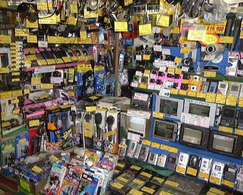
The image I found is that of an electronics store in Akihabara, a really quaint, out of the way, not known about part of that small town called Tokyo. This image works on multiple levels, especially to someone who really loves electronics (such as myself). We can see a vast array of different items on display, all maticulously tagged and priced properly, ordered within a "tiny space". What we don't see IS if this is in actuality a tiny space due to the angle of the camera. This image gives me a claustrophobic feeling making me feel as though all stores like this would be small and jam packed, but for all we know this is one small wall in the world's largest department store (SPOILER: It really isn't.). 

The neat thing about this picture though is that at first glass, it is extremely chaotic. Just look at all that stuff shoved in there. But when you give it a second look, realize the order and grouping, and how everything is tagged, you now see order and peace. I find this very interesting because glancing at the image, and then studying the image really give you two seperate feelings. I think the colors in the image also work to this effect. At a glance, you see all that bright yellow paper sticking out at odd angles, which makes you see this image as uneven. But when you study the electronics which do not stick out as well, you see the order. Once you find this order, then look back at the yellow paper, you find that they aren't chaotically sticking out at different angles, but instead acting as children to their parent electronical device, making their positions totally sane and ordered.

I think I lost my train of thought here, but in a nutshell I see this as: An electronics store that offers skin-level chaos within deeper order. The ultimate place where you can learn a bit about yourself and pick up an IPOD Nano. So was this image taken with the ultimate goal of showing us that there is order in madness? Or could it have been done with a deeper, more sinister intention, such as showing someone's trip to an electronics store... you decide.

(Why is my text purple?)

EDIT: ORDER IN MADNESS!? How could I have left out my dear friend who proved there was order in madness!? RAMSEY THEORY.


Tuesday, January 20, 2009

EAS299 Test

Success! Go visit http://www.venatiocreo.com. Download the application and make a game!